3. HOW TO USE IT
Include ShadeBtn.H in your source file. To register the class with the Presentation Manager, call shBtnInit. The class is called WC_shBUTTON. To make a button, call WinCreateWindow as you normally would to create a button (except that you use WC_shBUTTON instead of WC_BUTTON as the window class).
I've tried to make it so that all you would have to do is replace WC_BUTTON with WC_shBUTTON. There are only a few button styles that Shaded Buttons does not support (see 3.1 for more info). I'm thinking of creating another class that would be completely compatible with normal buttons.
You can also make a button in a dialog box in a resource file. See the .rc files in the samples directory for an example.
When the button is pushed, it will send a WM_COMMAND (or WM_CONTROL) message to its owner, just like a normal push button does. It can also be activated by hitting the space bar when it has the focus.
To change the colour of the button, send it a shBM_SETCOLOR with mp1 set to the RGB value of the colour, and mp2 set to shBSC_BUTTONFACE to change the button face colour, or shBSC_BACKGROUND to change the background colour.
Another way to change the colour of the button is to use presentation parameters. You can also change the font this way. (see 3.3 for the presentation parameters supported) To try it out, drag a colour from the Mixed Color Palette onto a button in the demo program. Or drag a font from the Font Pallette. (Try doing that in Windows!)
To determine the version of Shaded Buttons, use shBtnQueryVersion(). It returns the version number * 100 (eg. v 1.20 -> 1.20 * 100 = 120).
When you link your program, link it with ShadeBtn.lib. (hopefully it should work with compilers other than emx. If not, let me know, and I'll see what I can do about it.) Make sure ShadeBtn.dll is in a directory in your LIBPATH.
Shaded Buttons is also a PMCX control, so it can be used in the Universal
Resource Editor, and Prominare Designer, as well as any other PMCX tools. Just
register ShBtn.dll and it should work fine. Make sure ShadeBtn.dll is in your
LIBPATH (or in the same path as ShBtn.dll), and make sure that you add
ShadeBtn.h to your header file before you try to compile.
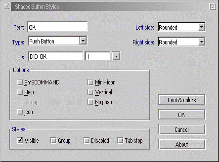
(screen shot - 34k)
These are the button styles supported by Shaded Buttons. All the styles that
it has in common with normal buttons (except shBS_NOBORDER) are equivalent to
using just BS_xxxxxxx.
3.1 Button Styles
| shBS_PUSHBUTTON | creates a pushbutton (default) |
| shBS_CHECKBOX | creates a check box |
| shBS_RADIOBUTTON | creates a radio button |
| shBS_3STATE | creates a 3 state button |
| shBS_AUTOxxxxx | makes the button automatically check/uncheck itself (AUTORADIOBUTTON is not implemented yet) |
| shBS_ICON | uses an icon instead of text. Uses button "text" as the id number of the icon. The text should be in the form "#[iconid]<,[disablediconid]>" where [iconid] is the id number of the icon, [disablediconid] is the id number of the icon to be displayed when the button is disabled. The portion in between the triangular brackets ( "<...>" ) is optional. Normal text can be placed at the end, and will be displayed along with the icon. |
| shBS_BITMAP | like shBS_ICON, but uses a bitmap instead. |
| shBS_MINIICON | same as shBS_ICON, but uses the smaller icon size |
| shBS_HELP | sends a WM_HELP message when clicked |
| shBS_SYSCOMMAND | sends a WM_SYSCOMMAND message when clicked |
| shBS_DEFAULT | makes the button the default |
| shBS_NOLEFTLINE | removes the border on the left side of the button |
| shBS_LEFTROUND | makes the left side rounded |
| shBS_NORIGHTLINE | removes the border on the right side of the button |
| shBS_RIGHTROUND | makes the right side rounded |
| shBS_VERTICAL | makes the button vertical (left to right gradient pattern) |
| shBS_NOTOPLINE | removes the border on the top side of the button (when VERTICAL is set) |
| shBS_TOPROUND | makes the top side rounded (when VERTICAL is set) |
| shBS_NOBOTTOMLINE | removes the border on the bottom side of the button (when VERTICAL is set) |
| shBS_BOTTOMROUND | makes the bottom side rounded (when VERTICAL is set) |
| shBS_NOPUSH | makes the button non-pushable (eg. to make status bars) |
| shBS_NOBORDER | removes the border on the edges of the button. (left and right borders if horizontal, top and bottom if vertical) |
I've tried to make it as compatible with the normal button class. Unless you
use BS_NOPOINTERFOCUS, BS_NOBORDER, BS_NOCURSORSELECT, or BS_AUTOSIZE, you
should be able to just replace WC_BUTTON with WC_shBUTTON in your source files.
(Note that shBS_AUTORADIO and shBS_USERBUTTON aren't implemented yet.)
Shaded Buttons sends the following messages to its owner:
3.2 Window Messages
| Message | Description |
|---|---|
| WM_COMMAND | Sent when the button is clicked (when it's a push-button). mp1: Notification Code | ID mp2: CMDSRC_PUSHBUTTON | pressed by keyboard? the notification code can be one of BN_CLICKED, BN_DBLCLICKED (not implemented), BN_PAINT (not implemented) |
| WM_CONTROL | Sent when the button is clicked (when it's a radio button, check box, or 3-state). Message parameters are like for WM_COMMAND. |
| WM_SYSCOMMAND | Sent when the button is clicked (when it's a push-button and has the shBS_SYSCOMMAND flag set). Message parameters are like for WM_COMMAND. |
| WM_HELP | Sent when the button is clicked (when it's a push-button and has the shBS_HELP flag set). Message parameters are like for WM_COMMAND. |
Shaded Buttons handles the following messages:
| Message | Description |
|---|---|
| WM_CREATE | Sent when the button is created. The button saves the button text, the presentation parameters, loads icons if necessary, sets up variables for painting. |
| WM_DESTROY | Sent when the button is destroyed. The button unloads icons that it has loaded, and frees up memory that it allocated. |
| WM_PAINT | Sent when the button is to be painted. The button paints itself. |
| shBM_SETCOLOR | Sent when the button colour is to be changed. The
button saves the colours, and redraws. mp1: RGB value of the colour mp2: shBSC_BUTTONFACE for the button face, or shBSC_BACKGROUND for the background. |
| WM_SETWINDOWPARAMS | Sent when a window parameter is changed. The only window parameter handled is WPM_TEXT |
| WM_QUERYWINDOWPARAMS | Sent when the program wants to query a window parameter. Handles WPM_TEXT, WPM_CCHTEXT, WPM_CBCTLDATA and WPM_CTLDATA. |
| WM_QUERYDLGCODE | Returns DLGC_BUTTON or'd with either DLGC_PUSHBUTTON, DLGC_RADIOBUTTON, or DLGC_CHECKBOX |
| WM_QUERYCONVERTPOS | Returns QCP_NOCONVERT. I don't know why, but Prominare said to do it. |
| WM_PRESPARAMCHANGED | Sent when a presentation parameter is changed. The button saves the presentation parameters, and redraws. (see 3.3 for the presentation parameters supported) |
| WM_SYSCOLORCHANGE | Sent when the system's colour scheme is changed. The button saves the presentation parameters, and redraws. |
| BM_SETCHECK | Sent to set the state of a check box, radio button, or 3-state. The button sets its state. |
| BM_QUERYCHECK | Sent to query the state of a check box, radio button, or 3-state. The button returns the state. |
| WM_BUTTON1DOWN | Sent when the mouse button is pressed. The button sets appropriate flags, and redraws the button (in the "down" state). |
| WM_MOUSEMOVE | Sent when the mouse is moved. The button checks if the mouse button is pressed, and if the mouse is inside the button. Redraws if necessary. |
| WM_BUTTON1UP | Sent when the mouse button is released. Sets appropriate flags, and redraws if necessary. Changes state if it's an AUTOxxxx |
| WM_ENABLE | Sent when the button is enabled or diabled. Redraws. |
| WM_SETFOCUS | Sent when the button loses or gains focus. Sets appropriate flags, and redraws. |
| WM_CHAR | Sent when a key is pressed. Action taken depends on the key pressed. (see source code for details) |
| WM_SIZE | Sent when the button is resized. Recalculates text position, and redraws. |
| WM_PAINT | Sent when the button is to be repainted. Repaints. |
| WM_DESTROY | Sent when the button is being destoyed. Destroys resources. Frees allocated memory. |
3.3 Presentation Parameters
The presentation parameters that are supported are:
| shBPP_BUTTONCOLOR | change the button colour (using RGB values) (equivalent to PP_BACKGROUNDCOLOR) |
| shBPP_BUTTONCOLORINDEX | change the button colour (using colour indices) (equivalent to PP_BACKGROUNDCOLORINDEX) |
| shBPP_BUTTONBGCOLOR | change the background colour (using RGB values) (equivalent to PP_USER) |
| shBPP_BUTTONBGCOLORINDEX | change the background colour (using colour indices) (equivalent to PP_USER+1) |
| PP_FONTNAMESIZE | change the font |
Back
Last updated March 21, 1998. <><
Created by Hubert Chan.
Optimized for Netscape 2.02 for OS/2.